Typography
Our warm typography pairs perfectly with our tone of voice, reflecting the thoughtful, human spirit of the brand.
Brand typeface
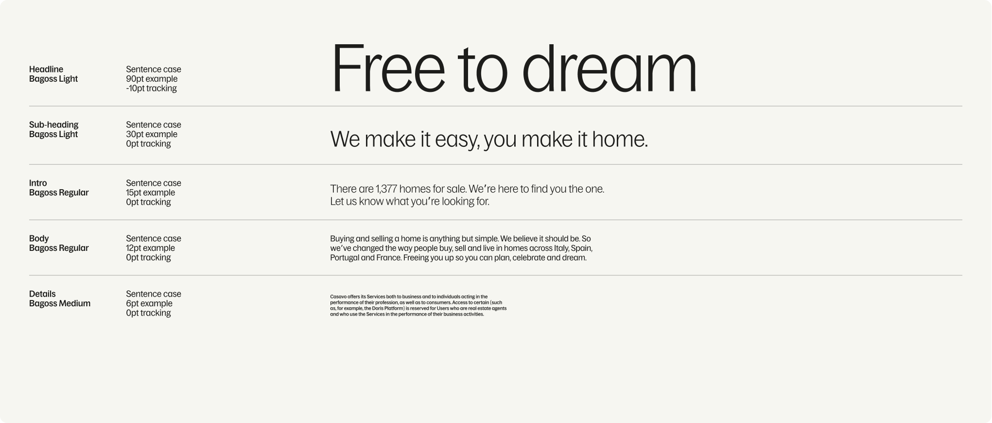
Specimen
Our letterforms contain unique design details. Use the specimen below to familiarise yourself with our brand typeface.
Supporting typeface

Type hierarchy
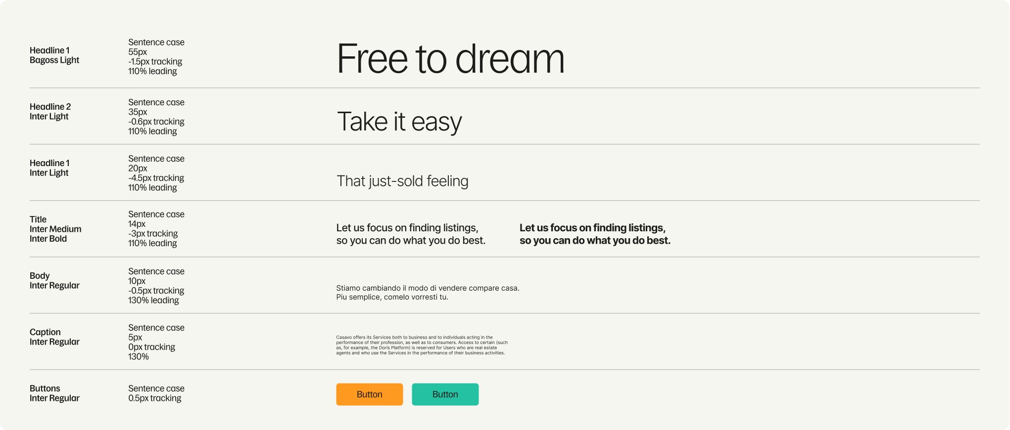
Digital
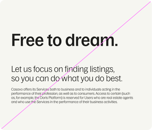
It’s important to follow our type hierarchy. This ensures that our communications are consistent and impactful.
It’s important to follow our type hierarchy. This ensures that our communications are consistent and impactful.
Things to avoid
01

Do not stretch, distort or add any effects to the type.
02
Don’t use our type styles for anything other than their intended purpose.
03
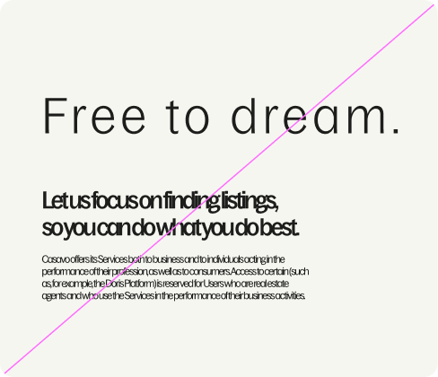
Don’t track type or apply leading outside of guidance.
04
Do not use unspecified colours.