Logo
Our logo is the beacon of our brand. Inspired by the concept of an opening door - it is an emotional, tactile and unique symbol that encourages us to imagine what's possible.
Logo suite
Colour usage
Sizing
Clear space
When using our logo assets, always give them room to breathe. A recommended clearspace is indicated below. Remember to always use the artwork supplied.
Minimum size
Follow the guidance below to make sure both our wordmark and symbol are legible on every application we produce.
Hierarchy
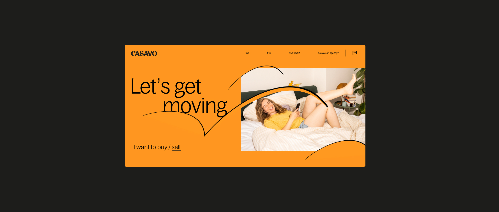
Digital
On our product, we should use our wordmark to retain brand equity. Once within the app we can revert to using our symbol.
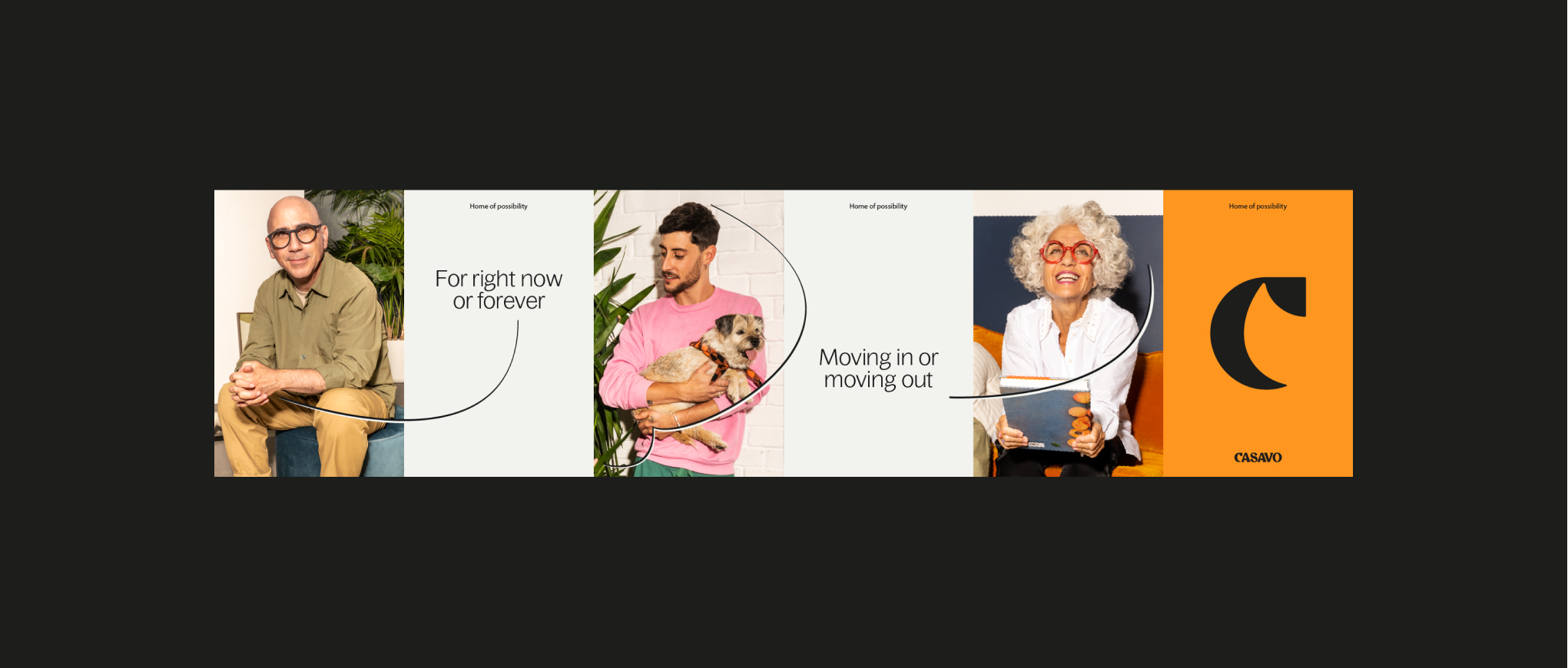
See the examples below as a reference.
See the examples below as a reference.
We should use our wordmark as the main logo asset in our applications to retain equity. For certain print applications such as a wheatpaste, we can use the symbol as the hero asset.
Billboard
Wordmark
Throughout the majority of our applications we should use the wordmark for equity purposes.
Wheatpaste
Wordmark + Symbol
We can use our symbol as our hero logo, but it must be situated near the wordmark.
Usage
Placement
These examples show recommended logo placement in layouts and artwork. Always ensure there is a sufficient amount of space around our logo so it has room to breathe. For more guidance refer to the layout section.
Small scale usage
We use the same margin rule for small scale usage, for example social avatars or app icons. Changing the background allows flexibility for Customer and Broker.
Descriptor
When creating further descriptor lock-ups, follow the rules below to make sure they are visually consistent. Use Bagoss Condensed
Regular.
Regular.
Partnerships
When creating partnerships with third parties, follow the guidance below to make sure the hierarchy and placement
is correct.
Things to avoid
01
Do not change the size of our symbol.
02
Do not combine the symbol and wordmark in a lock-up.
03
Do not use the logos as outlines.
04
Do not use illegible colour combinations.