Illustration & iconography
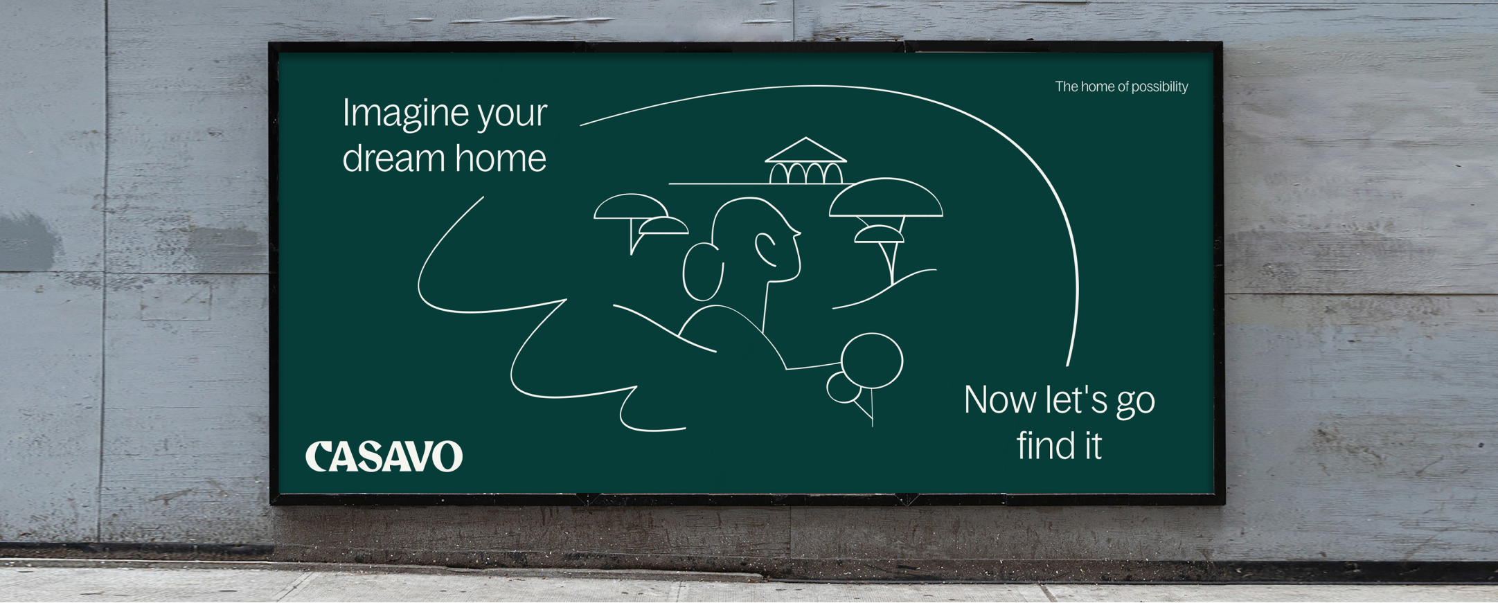
Our expressive, distinctive illustration style
celebrates key moments along the customer
journey in a human way.
Overview
Our system
We have three tiers of illustrations to help us tell distinct brand stories.
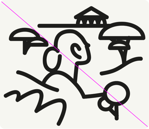
Tier 1
Details
Hero illustrations bring the Casavo feeling to life. Use the following guidance to create illustrations that feel stylistically in line with our visual language.
In use
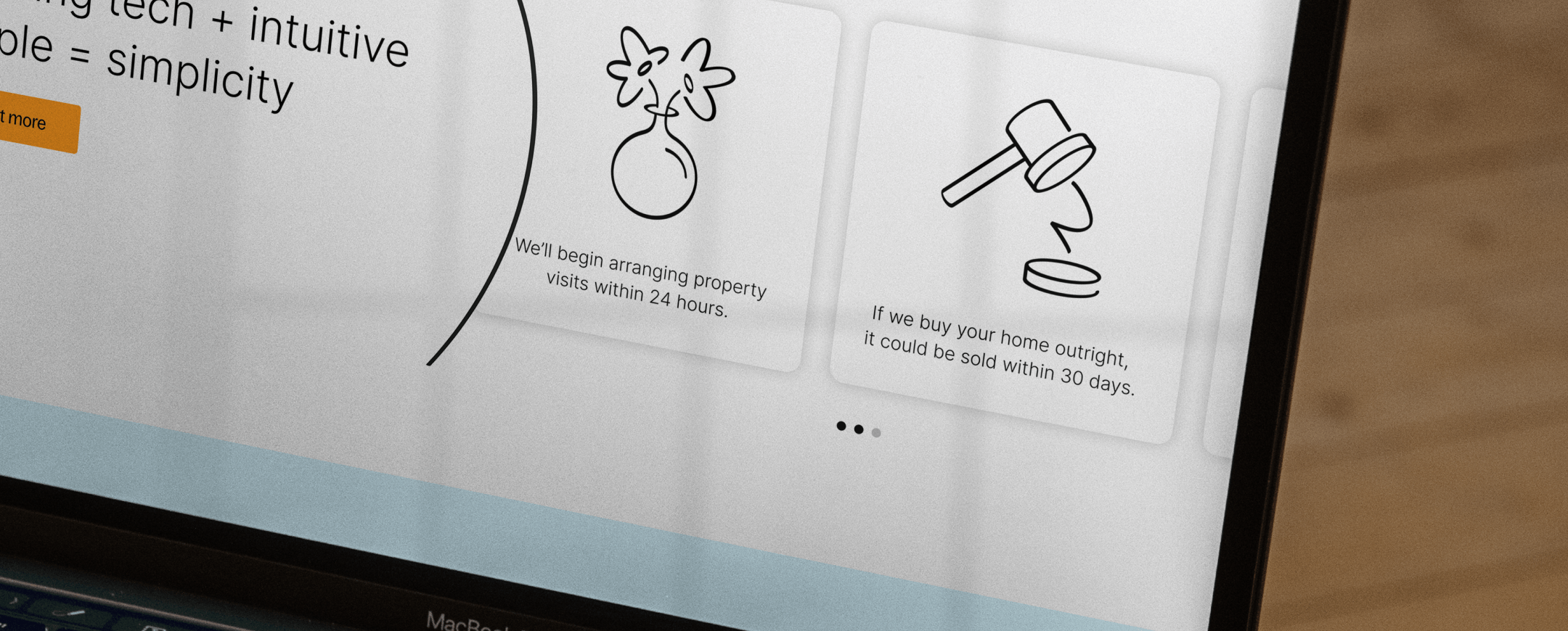
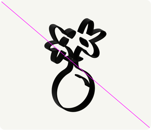
Tier 2
Details
Functional illustrated icons sit seamlessly next to hero illustrations. Use the following guidance to create illustrated icons that feel stylistically in line with our visual language.
Construction
Functional illustrated icons are created using a 40x40px grid. One element always sits off the grid to create movement. We use the uplift brush stroke with a stroke weight of 0.12px.
Minimum sizing
Minimum sizing guidance ensures our functional illustrated icons are always legible in digital and print.
In use
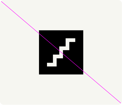
Tier 3
Tier 3
For UI icons, we use the Material icon suite. These are functional icons used at small sizes within digital.
Details
The following options should be selected when downloading Material icons.
Construction
Material icons are created using a 24 x24 px grid with 1px padding. Refer to material.io for more guidance on creating Material icons.
In use

Things to avoid
01
Do not change the brush stroke settings.
02
Do not change the brush stroke settings.
03
Do not use filled UI icons.
04
Do not tilt, rotate or make icons appear three-dimensional.