Graphic system
Our graphic system is a visual representation
of the uplifting spirit, attitude and ambition of
our brand.
Overview
Details
Below is an example of our Uplift lines. Follow the design guidance to make sure our graphic device is always visually consistent and impactful.
Example
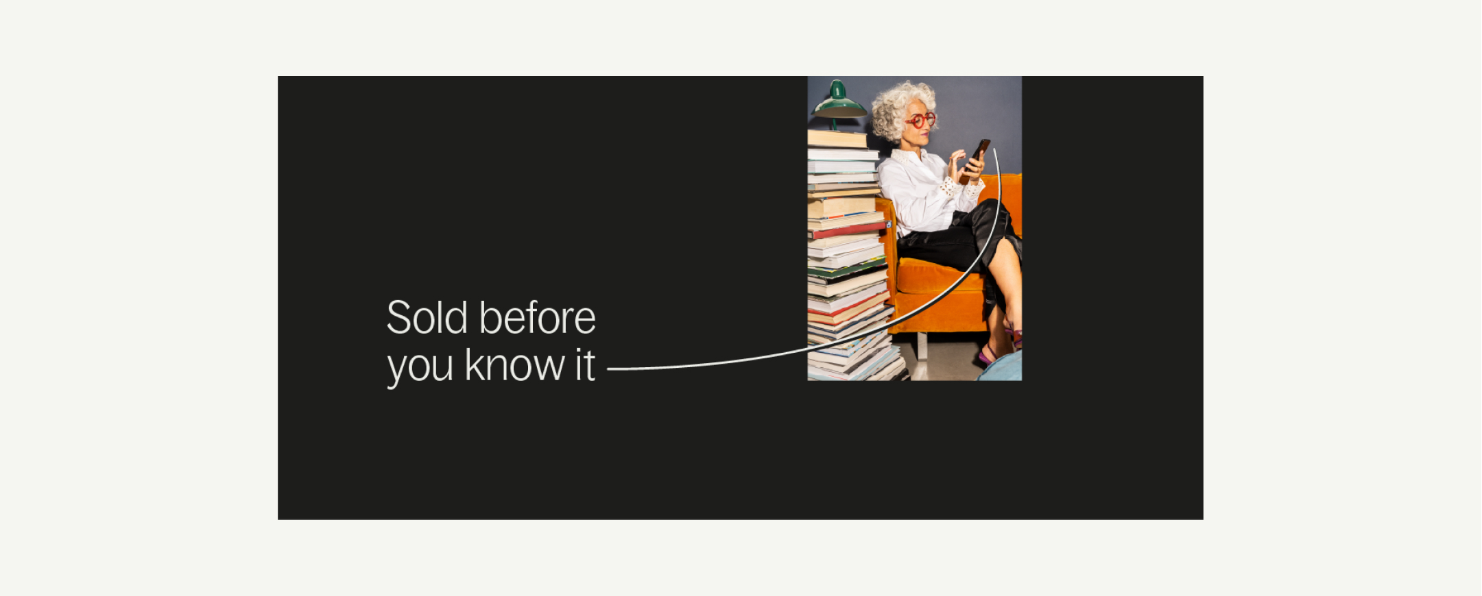
Below is an example of the Uplift device in application. It should always create a sense of movement and energy. We can also use Movement lines to accentuate this energy.
Variations
Sizing
Everyday sizing
To create consistency in the stroke size of our Uplift device,
make sure to follow the guidance below. We always use the shortest edge of our document to determine the size of our line.
Expressive sizing
To create consistencty in the stroke size of our Uplift device,
make sure to follow the guidance below. We always use the shortest edge of our document to determine the size of our line.
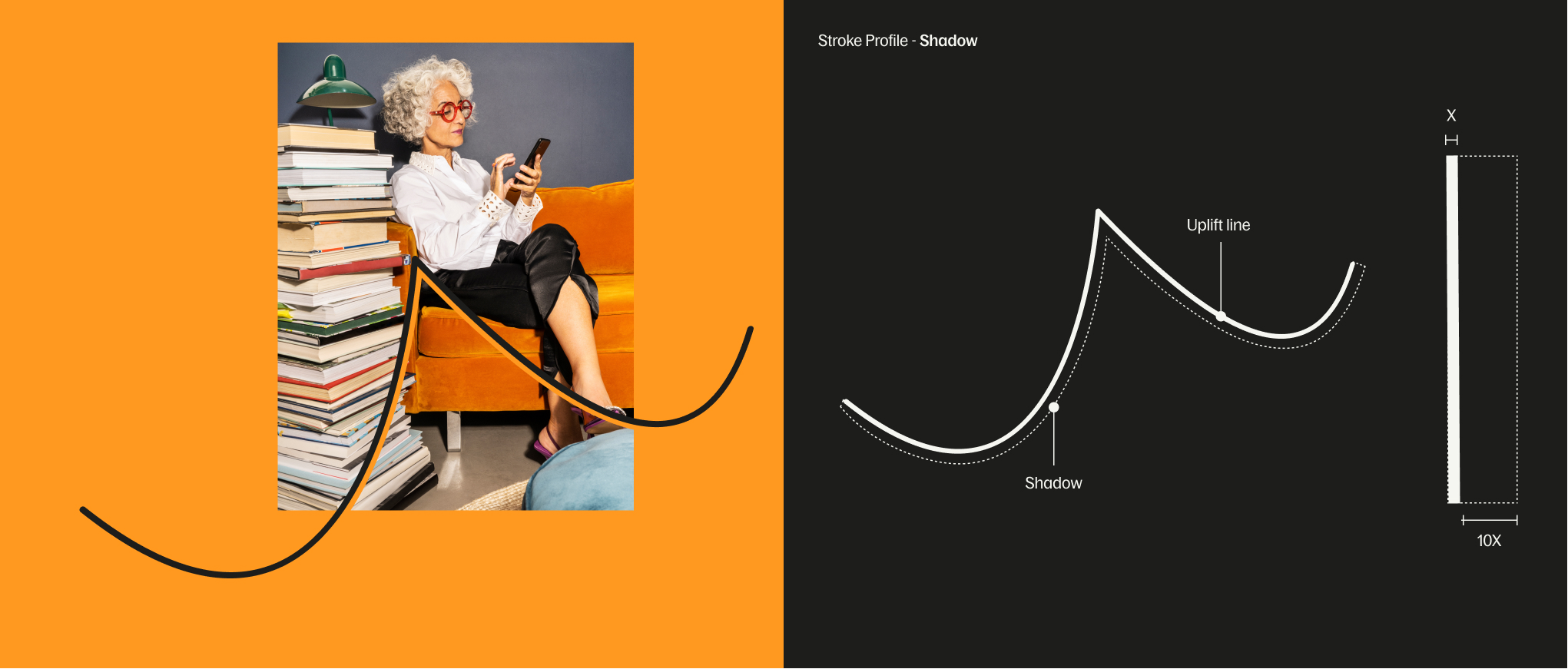
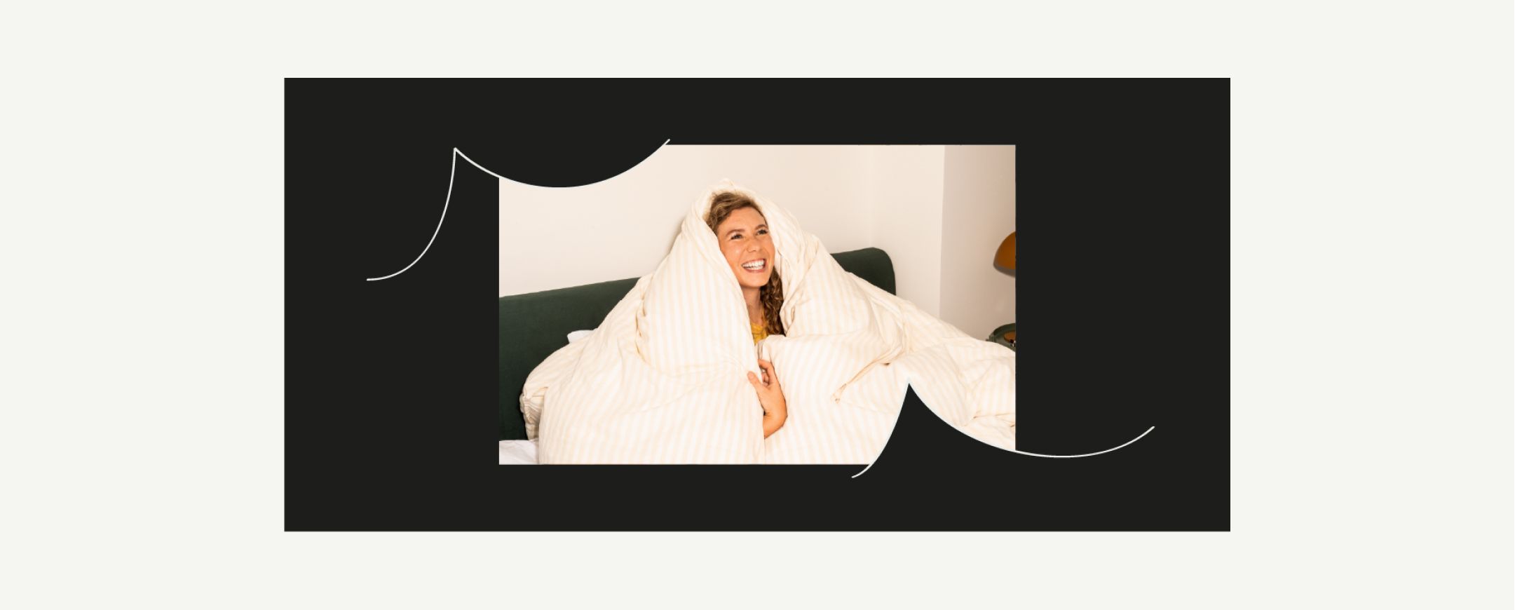
Shadow
When using a shadow to overlap typography and imagery,
it should be 10x the width of our Uplift device.
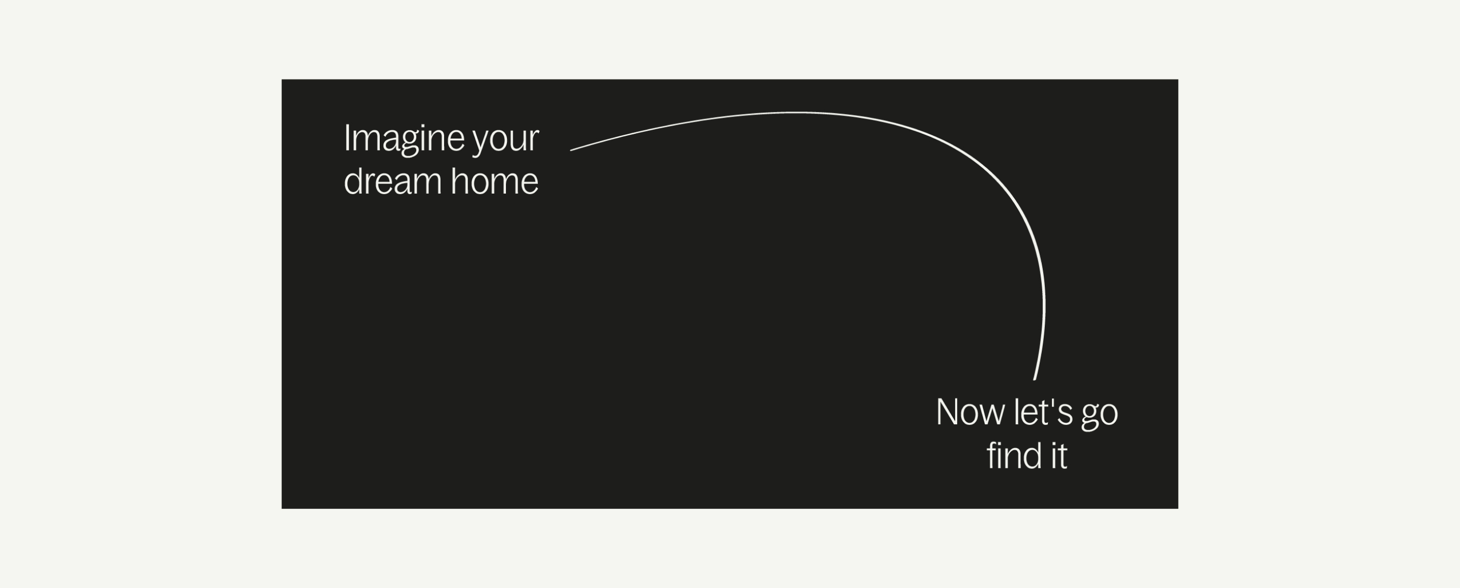
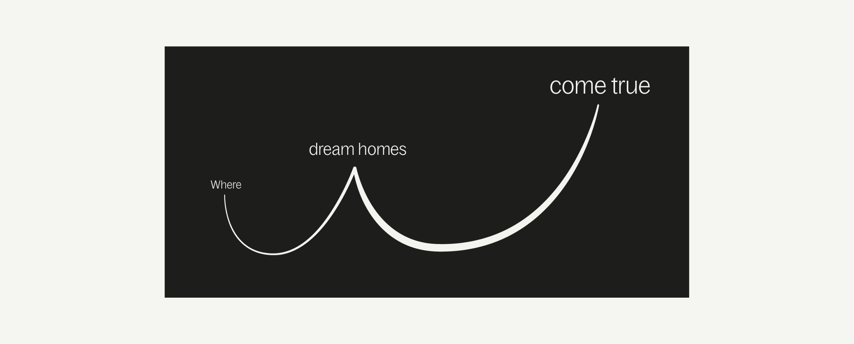
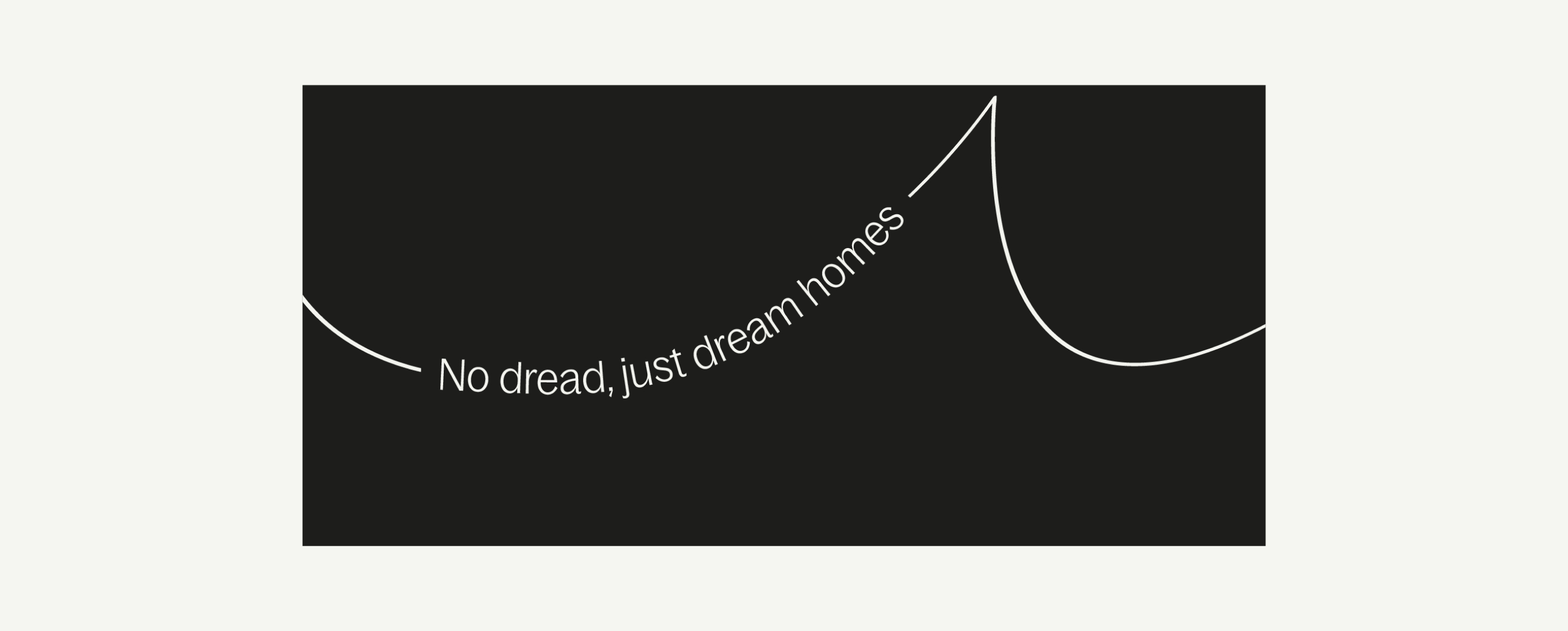
Typography
Examples
Here are some examples of how our graphic device works in relation to our typography. When using our Uplift device we do not need to include punctuation.

Art direction
Examples
Here are some examples of how our graphic device works in relation to our imagery and art direction.

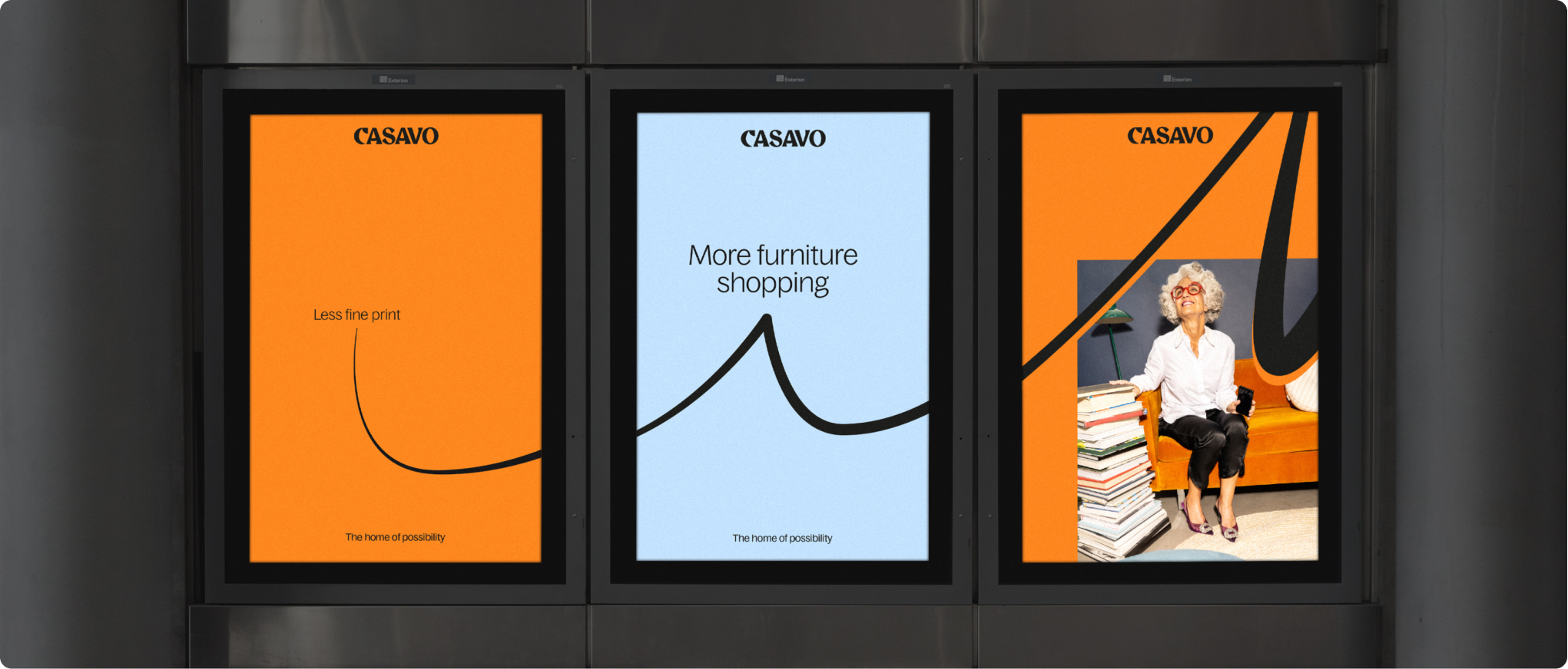
Sequence
Build
Our Uplift device can also be used in sequence. An example of this is a series of digital posters or posts on Instagram.
Things to avoid
01
Do not descend our Uplift lines.
02
Do not use incorrect stroke weights.
03
Do not use varying stroke weights.
04
Do not overuse Movement lines.